Thursday, 9 February 2012

Evaluation Question 3 - Part 2

To gather audience feedback we had our media class and friends take a look at our music video and give us feedback using these orange sheets, The above picture is an example of two of the feedback sheets we got from them. The main issues we got were about the lack of a lot of ranges of shots in our video which we didn't think was there. This is why it is good to get feedback from different people as you get to see what your work comes across as to other people. 

I agree completely with the feedback we received which is nice, I thought that we could've done more of a variety of shot frames to keep it looking interesting but one problem with that was the fact that we were trying to go for a documentary styled video which started to block us from doing certain shots. This was because we had to stick to having longer shots and more standardised framing to keep in line with documentaries actually on TV. 


One limitation of doing feedback sheets could be that it's people's opinion and it could come across as beneficial for the us (the people gathering the information) although there are strengths and weaknesses for it, I feel that it helped us to properly evaluate good and bad points of the whole campaign.

Evaluation Question 3 - Part 1 (Wordle)

We had feedback sheets given to us from our peers so that we could hopefully get some constructive feedback that would help us to evaluate what we'd done overall. We got some feedback sheets back from our class and split them between the three of us to analyse them.

Here is the positive feedback we got from the sheets we gave out to classmates sorted out in Wordle:

I also organised the negative feedback with Worldle which is below:

I can see from the other members of the group's wordle analysis' that we all got some pretty similar results which show that the problems are being seen by people more so maybe we should've looked into them more when completing the music video. 

The feedback we got was overall very helpful and I would definitely choose this method again when wanting to evaluate.

Evaluation Question 2 - Part 2

These are our digipak and website final designs, along with our video I think that they all work fit the same purpose. I feel that the campaign all together works for the target audience we were aiming for which is a big bonus!
the use of the pictures and where we filmed went well together due to the shabbiness of the location of both the pictures and where we filmed. 
The relationship between the website and the CD digipak is quite strong, we kept dark colours such as black and white, with minimal colouring. The black and white picture on the back cover was the first picture we thought of using on the CD, as Matt another member of the group was taking pictures for his photography coursework we ended up using his photography on both the CD covers and the website - although this isn't obvious through the pictures it is a big connection between the two.

These are the website homepage and digipak pictures of The Who, which are a band from the same genre at The Jam.
You can see the theme that is travelling between the two which is what we were trying to aim for when creating our campaign. This is shown through the logo that The Who have used throughout their musical career. It is a well known logo which most people know of. Although a lot of people know the logo but don't know the band - even knowing the logo is giving publicity to the band even after all of these years.
In comparison to the campaign we produced I feel that although the quality of our work differs (obviously because they were done by professionals and we are only A Level students) the way we have created our links are different but would still work in my opinion.
On the two pictures surrounding, you can see the theme of the genre we were trying to keep within and what the town called 'Malice' is about. In the first screen grab we have our actor in the foreground and in the background, a homeless person swearing at him. We thought that this would be effective due to the image we were trying to create. With 'Malice' being a visibly horrible place, yet us trying to promote it. We hoped that the irony would could through with the whole campaign put together. 
On the second picture above, we did a pan of the surrounding area to where we were filming. I thought that this shot worked well as it helped to reinforce the idea that we were creating through the music video. The pictures we used in the digipak related well to this particular shot which helped to bring the whole campaign together in a fluent way.
The picture with the homeless person holding the cardboard cut out worked well as the keyword being 'malice' as shown many times throughout the video helped to build the bridge between the video and the website/digipak. 
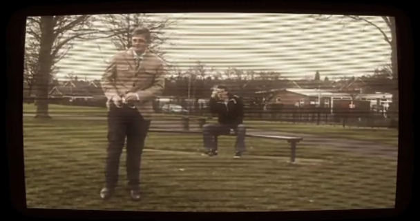
The screen shot with the colour bars was initially an idea because we had recorded one of the clips in the wrong timing so the lip syncing was out - although it seemed a problem at the time we think that it has worked out for the best. The use of the camera failing in the middle of the song looked really good. It helped to make the video look older as it's what happened to TVs back in the 70s which luckily, is the era that we were aiming to stick to whilst filming and creating our whole campaign. 
The shot with the supermarket in the background formed from the lyrics 'stashed against the co-op'. Although it's obviously not a co-op we wanted to make the lyrics relate to what we were showing on screen more, as we found after filming for the first time that although it looked okay - we agreed that we needed to make the lyrics and footage match a bit more so that it still looked like a music video.
This close-up I believe worked really well as in the background there is a brick wall to assure concentration on the face - which again relates to the background of our website design which features a brick wall. Although it's only a minor similarity for a brick wall we thought small and wanted everything to fit in perfectly. 
The picture to the right shows a still of our actors feet, in the video he moves and dances to the rhythm of the song so it fits in really well. Also the shoes that he is wearing were very commonly worn in the 70s which again brings everything back to our whole campaign working well in sync.


This picture is from the end of our video, originally we were just going to have the music video fade to black but we thought as we had the idea to make it a documentary, we thought having the BBC logo that was commonly on after everything on TV in past years. This made us feel like we'd created a mock TV documentary - and brought back some childhood memories!


Evaluation: Question 3 - Part 1

Although we are very happy with the overall mark (34 out of 40) that we were given, there are still some area's of the music video that could of been improved further. Each pair in the audience (20 people) was given an anonymous feedback sheet to fill out. This tells us what worked well in our video and what needs improving.


On the feedback sheet on the right it shows that they didn't feel there was enough variety of shots in our music video. This was an aspect that we were aware of during the production of our music video. Personally, I agree that there was a lower amount of close ups than seen in other music videos and the previous  A Town Called Malice video (Youtube). However, because the music video was a hybrid of a music video and a documentary of a location, we had to meet conventions of both media texts. Upon our research we found that documentaries use a lot of establishing and long shots (Example of researched documentary video - Birmingham Bullring 1985 (Youtube), a contrast to what we see in a performance style music video. To overcome this problem we used as many close ups as possible whilst the actor was performing and we weren't showing the surroundings of 'Malice'. As well as close ups of performance we included close ups of key props and surroundings. (Examples can be seen below)

                    
                      Close-up of performance
Close-up surroundings
One of the sheets also explained that they spotted some errors with lip-syncing. One of the problems that we came across during our production was lip-syncing with the addition of effects. Once we had edit our music video we ensured that all of the lip syncing was on time and to the best standard possible, however once we applied after effects on iMovie the syncing seemed slightly off. After some analysis we realised that it was the 'television bars' and 'Bump distortion' that had caused the problem. Because the video now looked like it was poorer quality and was distorted, some of the lip syncing seemed slightly off time or incorrect. This was an aspect that could not be helped, however if we were to do the project again we would reconsider the use of after effects or the intensity used on them. This was also a critique  mentioned as some of the audience members found the effects overpowering and over the top.

Evaluation Question 3 - Part 2

Using wordle I made a map of all the words in the box for what needs improving from each feedback sheet. In conclusion to what we can see on the mind map, we can gather that a wider variety of shots should have been used and the lip syncing needs to be corrected. One of the only problems with this feedback is that it isn't taken from a variety of people. Most of the audience members were 17 or 18 years old, meaning that some of the results could be biased if their opinions were a result of age. Another reason that our audience feedback could be biased is because the audience was all Media students. This means that they were critiquing our video from a technical point of view and not watching it from an entertainment standpoint.

Despite the possibly biased feedback, I feel that it is accurate. If we had longer on the production of our music video then we would look at the strength of the effects added post-editing. By doing this we would have resolved the problem of the lip-syncing that is hard to see and understand by slightly manipulating the shot lengths. As well as this,  we may have possibly been able to shoot more footage which would have included more close-ups and mid shots, adding the variety that was wanted from the audience .

Evaluation: Question 2 - Part 2


The existing web page for the Sex Pistols sells the band through using a video in the top right of our image. This is an aspect that we tried to include in our work, we placed the video in  the section along with the tour dates and band information. However, because the program we was using (iWeb) didn't allow moving pictures or GIF files we could not recreate what we wanted to. Instead we added a box that included the original video for A Town Called Malice (seen below, right).


The other album cover that we looked at was Never Mind The Bollocks by the Sex Pistols. The album art is very simple, with the main feature being the bands name. This is something that we should be relevant in our work. In some of the our first plans we had a very similar idea to this (seen above, left). With no artist featured on The Sex Pistols CD cover we thought it would appropriate if we did the same, however with nothing on the front that represented the band we felt it necessary to add an image of the fictional place known as 'Malice'. This can be seen in the image below this paragraph. 


Other aspects that we looked at on the website was that of tour dates. I feel tour dates are essential in the production of a website as it lets the audience know that the artist is doing something and further merchandises as they may see a date that they can attend and buy a ticket to the event. Because I feel tour dates are an important aspect to be included on a website homepage we dedicated a large portion of the information box to the tour date list. The overall purpose of our campaign is to promote the artist and the song that we have published and produced a video for. In addition to this, the purpose to our three production is conveying the documentary theme that we decided the project would be based around.

Evaluation: Question 2 - Part 1


Throughout our campaign we have attempted to keep a theme of documenting the fictional location of 'Malice' in all of our work. Whether it be the CD cover, website or final music video every aspect of our campaign in some way relates to a documentary theme or promotes the band and record in question. Below you can see our finished digi-pack which was created and manipulated in photoshop. As a group we all contributed ideas towards how to include the documentary theme of showcasing 'Malice' and this was our final outcome.
Front and back CD cover
Inside CD cover and CD

Webpage


This theme is present in our digi-pack through the images of 'Malice' and it's surrounds that we took. It also features images of our music video and the 'presenter' that is present throughout the production. This allows the audience to see a definite relation between the two media texts. As well as this, our Website conveys a similar look and theme, portraying more than one image of 'Malice' and it's surrounding that we are prominent in our music video. We also used a running colour scheme in the three media texts that we produced of: black, grey, white and blue. The reason that we chose these colours is because they are relevant to The Jam and can be found in their logo. (Seen right) We felt this was important as the bands image and style needed to be maintained in all areas of our work.


In our music video we carried on portraying the theme of The Jam's style and image. Whether it be through colour, the era in which the artist performed and produced music, or the genre in which they belong to. For example, in the first image seen on the left we can see that we use the word 'Malice' a number of times in our music video. This allows the audience to make the connection between the three projects that we have produced and the relevance of our 'Malice', which is heard in the song numerous times to our music video concept.

In the second image down, we can see the surroundings of Malice, which is once again conventional to the overall documentary theme present throughout all area of our campaign. These images of the 'Malice' and the surrounding areas contribute towards The Jam's 'British' style and image that we want to get across in our campaign. Because every shot or picture of the surroundings of 'Malice'  that we used are different, it allows us to use similar images in all ares of our work without it becoming overly repetitive. 


To accompany the surroundings seen in our music video we also added shots of vandalised areas adding to the gritty, alternative style that complements the artist's style. This can be seen in the images the to the right and below.


In the image to the left and below you can see that we used close ups to conform to conventions of music videos. This lets the audience know that the artist is included in the video and the image that they are showcasing to their target audience.


In the image to the left we get a close up of a shot of feet dancing. This also tells the audience that we are aware the music video isn't just a documentary of malice but also is their to promote the record and band as well.


In the final two images we took clips off already existing documentaries and added them to our own project. This gave our music video the final documentary look that we aimed to achieve. By doing this we eliminated any confusion in case the audience didn't know what we were trying to achieve with our video or the style of filming that we were trying to mimic. By making everything in our video convey to the aspects of a media text produced in the 1980's we aim to achieve a look that the target audience (younger and mainly middle aged males) will recognise or at least be aware of.

Wednesday, 8 February 2012

Evaluation: Question One - Part Two


Example of videos
 with/without sepia

Our campaign developed the existing music video's conventions into a more entertaining modern production by mixing it with a documentary style of filming. However, by keeping the performance of the vocalist in play during the video it still held some of the conventions of an existing video by The Jam. Although there was some performance featured in our production it did not reflect the bands image completely, meaning that we had to reflect the artist through use of mise en scene and camerawork  throughout our video. We did this by giving the video a working class, 'British' feel. This portrayed the bands image and style onto camera and also complemented our idea of showcasing a low class area of the UK during our production. Techniques such as the added sepia effect made the visuals gritty and true to the bands image and sound, with the additional dull surroundings that we filmed, the mise en scene complemented the bands dark and gritty style completely.

Example of a pan in our video


We stuck to conventional filming techniques from both a music video and television documentary in our production. We used shots of a longer length (around 5-10 seconds) as well as using numerous pans and zooms to convey to the style of filming seen in a  television documentary. Whilst simultaneously using numerous close-ups which is a convention frequently seen in almost every music video.

Our music video could be classed as postmodern through using the idea of a hybrid style video. This has been done before as a narrative is unconventional to the original music video's seen in the 1980's. In fact, narratives mixed with performance is seen in nearly all music video's released now days. A perfect example being Lady Gaga's Telephone (seen below). 

Evaluation: Question One - Part One


Whilst we were researching in the planning stages of our music video for A Town Called Malice, we decided that we wanted to stray from the look and theme of the videos already produced by The Jam. The main reason for this being that the original music video for A Town Called Malice (top left) was released in 1982, a time when technology was a lot less developed and music videos played a much smaller role in promoting artists in industry. This was mainly because they were rarely broadcast on daytime television and the internet did not exist. Thus, because the audience was not able to watch a music video, there was no demand for them. As a result of this most music videos of the same era were largely performance based with no narrative, and used only one location. This was purely done for convenience and because it was easy to create, especially if the live performance was already recorded as part of an existing television program. An example being The Jam's video for All Around the World (found below this paragraph) as it was recorded as part of the Marc Bolan Show in 1977. In summery, when the video for A Town Called Malice was released, it's purpose was to convey the bands song image to the audience on a less frequent occasion, and as a result was not made to be as entertaining as music videos of today. However, as the music and television industry has developed they have used synergy to market artists and there music video's to a now demanding audience. To accommodate the now growing demand to see music videos, we had to make the idea for our production more entertaining and relevant to the style of music videos produced today. This meant that we had to flout the original conventions produced by The Jam's existing videos to make our campaign more successful.


To make our idea unique we decided that we needed to combine our music video with another style of broadcasting, and after looking at more modern music videos such as the Prodigy's Smack My Bitch Up  (bottom right) it became prominent to us that the music video doesn't always have to feature the artist in it to convey their style. After looking into various idea's we all decided that our music video would be a hybrid of a television documentary and a performance styled music video. With the influence being a old style television documentary about the Birmingham Bullring's opening (bottom left) and the original A Town Called Malice video (top left).


Audience Feedback Mark

I our lesson last week our video was showcased to the class for critique. This helped us with our evaluation and also identified problems that are prominent in our music video. Overall our feedback was very positive, the average score was around 34 marks out of 40 matching the level 4 criteria which is the highest you can achieve. We are extremely happy with the result for our music video and the marks that came with it. 

Tuesday, 7 February 2012

Wordle, negative feedback

This is a Wordle print that I have constructed with negative feedback from reviews of our music video. The ones that pop up most are close ups, acting and shots. The close up feedback I’m not surprised about because our music video is supposed to be a documentary which doesn't use many close ups. So we were sticking to our theme of a promotional video / report like the Bull ring one. Overall i think we have got some constructive feedback back that I can use and work on in future to make my productions better.

Wordle, Good comments from feedback.

Here is a Wordle print I have done with some comments for good feedback from our music video. the most defined ones are variety, editing and good. Overall there is some good comments in this Wordle that I am pleased to see that people have enjoyed our music video.

Evaluation question two part five

With our music video, digipak and website design they is lots of synergy within all of them. Firstly the inside pictures on the digipak are shot of the day we, went out shooting and of the malice board we made for our Video (the actor isn't the same due, to him refusing to re shoot, so we had to use a whole new actor). Secondly the photos throught out show synergy of where we shot as they are all photos from the day we shot at.
Finally the music video, digipak and website have the same message of advertising The Jam and the song A Town Called Malice.
http://youtu.be/Bfbc3d_u69s

Evaluation question two part four

This clips shows advertisment of the song (sets the scene) and shows comparison as both the original video and mine adverties the band / song.


This Clip was important when it came to editing our film as, we were missing a clip due to lip sinking and there wasn't any time left to reshoot. so we found this image of when a TV loses signal, and this comes up. we imported it as an image and set the time to as long as we needed. we also put the beep sound when this comes on. this makes it look like (along with the other effects) it's on tv and the music video not just malice it's self is a rubbish place as it cuts out half way through.       
The next clip shows that the reporter is oblivious from how bad Malice is, it's also the rebellious / cheeky style the Jam would do. It also is suited to the target audience as it's more appealing to a younger generation.


This clip is of the reporter that has tried to escape his working class past by becoming a reporter but, is found enjoying a fag which isn't very gentlemanly like in them days, so you see him running of trying to hide.


Overall we managed to maintain the same theme throughout with some of the same conventions as in the, A Town Called Malice video. We have also kept a clear picture of what we wanted to portray in our video.

Evaluation Question two part three

 Here are some clips that are in keeping with our theme of working class and a mod rebellious style. All of the clips have the same editing to keep an old theme of 70s running through out.

The shot of this sign shows that the place we filmed is un safe and not a very nice place to live in, it also keeps in with the working class theme of The Jam. plus as shown in screen shot from A Town called Malice official video of a sign, basiclly saying the same as the one in out video.

Here is a screen grab like The Jams, when filming we wanted to get  some shots of close ups, even though it is unconventional if it's suppose to be a documentary, as there normally long shots that either pan or track, but it's a music video and fits in with the theme.

In both the official music video and ours have the same outfits and hair style.