Tuesday, 7 February 2012

Evaluation Question two part three

 Here are some clips that are in keeping with our theme of working class and a mod rebellious style. All of the clips have the same editing to keep an old theme of 70s running through out.

The shot of this sign shows that the place we filmed is un safe and not a very nice place to live in, it also keeps in with the working class theme of The Jam. plus as shown in screen shot from A Town called Malice official video of a sign, basiclly saying the same as the one in out video.

Here is a screen grab like The Jams, when filming we wanted to get  some shots of close ups, even though it is unconventional if it's suppose to be a documentary, as there normally long shots that either pan or track, but it's a music video and fits in with the theme.

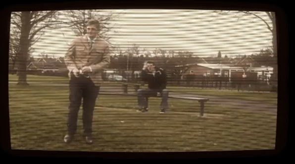
In both the official music video and ours have the same outfits and hair style.

Evaluation Question two, part two


Keeping with The Jam Theme we put in there record company on the back of our CD like they had it on there LPs / CDs


With the text on the Digipak and on the website we have used, is from Da Fonts, when choosing the font we first looked through existing Jam style fonts we then, made a survey to choose the one most suited to The Jam. As you can see from the Fonts below our CD cover and website are fonts that look like they have been on a real album.

Evaluation Question two, part one


This is the front cover of our CD for The Jam, A Town Called Malice, when creating our CD cover i took photos of where we were shooting, when taking these photos i was trying to create a working class feel. when choosing the colour of our CD cover we wanted to keep it in with the style of the jam so we used dark gritty colours so it matches with the working class target audience. when deisging the back i wanted to put the writing on the wall to make it look like it was spray paint to match in with the music video as it was on an estate and there was quiet a lot of spray paint around. This also suits with our working class audience.

Evaluation Question 2 - Part 1

We have created and maintained a mock documentary theme in our campaign, we wanted to create a documentary about worse off places yet trying to promote it. We thought that having this theme through our campaign would help to let them relate to each other more and keep it looking professional. An example of this would be the location that we filmed following through to the background features on the website and digipak.  
On the two pictures surrounding, you can see the theme of the genre we were trying to keep within and what the town called 'Malice' is about. In the first screen grab we have our actor in the foreground and in the background, a homeless person swearing at him. We thought that this would be effective due to the image we were trying to create. With 'Malice' being a visibly horrible place, yet us trying to promote it. We hoped that the irony would could through with the whole campaign put together. 
On the second picture above, we did a pan of the surrounding area to where we were filming. I thought that this shot worked well as it helped to reinforce the idea that we were creating through the music video. The pictures we used in the digipak related well to this particular shot which helped to bring the whole campaign together in a fluent way.
The picture with the homeless person holding the cardboard cut out worked well as the keyword being 'malice' as shown many times throughout the video helped to build the bridge between the video and the website/digipak. 
The screen shot with the colour bars was initially an idea because we had recorded one of the clips in the wrong timing so the lip syncing was out - although it seemed a problem at the time we think that it has worked out for the best. The use of the camera failing in the middle of the song looked really good. It helped to make the video look older as it's what happened to TVs back in the 70s which luckily, is the era that we were aiming to stick to whilst filming and creating our whole campaign. 
The shot with the supermarket in the background formed from the lyrics 'stashed against the co-op'. Although it's obviously not a co-op we wanted to make the lyrics relate to what we were showing on screen more, as we found after filming for the first time that although it looked okay - we agreed that we needed to make the lyrics and footage match a bit more so that it still looked like a music video.
This close-up I believe worked really well as in the background there is a brick wall to assure concentration on the face - which again relates to the background of our website design which features a brick wall. Although it's only a minor similarity for a brick wall we thought small and wanted everything to fit in perfectly. 
The picture to the right shows a still of our actors feet, in the video he moves and dances to the rhythm of the song so it fits in really well. Also the shoes that he is wearing were very commonly worn in the 70s which again brings everything back to our whole campaign working well in sync.


This picture is from the end of our video, originally we were just going to have the music video fade to black but we thought as we had the idea to make it a documentary, we thought having the BBC logo that was commonly on after everything on TV in past years. This made us feel like we'd created a mock TV documentary - and brought back some childhood memories!

Evaluation Question one part 2

is the opening scene from our music video that we have used. The footage is world in action titles, we thought this fits in with our documentary theme and gives a insight of what is to come.


When it came to making decision of how to make our music video different from the rest, we found inspiration from old promotional videos, such a the Birmingham bull ring, world in action, which the opening stars in our video and the full monty sheffield promotional video.


when editing our video we made our video look old and very much like the style of this bull ring promotional video by using a range of different effects through imovie, by using the sepia effect it made the video look old and a distorted colour brown that gave a 70s effect. the next effect we used was video lines to create a bad picture quality so it didn't look new, we then used Bump Distortion to create a TV effect and finally we used bloom.

Evaluation Question 1 - Part 2

                         
The video that influenced us the most was the old Bullring clip(above). Although it was short it heavily influenced us with our video, even down to the effects. We liked the idea of having the video look like it’s been filmed on a TV screen which we ended up using for the whole film after editing it all to lip sync properly. Here is a still from our video in comparison to the influence we used:


As you can see we have incorporated the idea of the TV screen. We thought that it looked better with the effects we picked, we used the iMovie program to edit the footage and used video lines, to give the effect of an old TV screen, Bloom which changed the glare of the video, bump distortion to change the shape of the video to make it look more like a TV screen with the shape and finally we added sepia to the video to take some of the vibrant colour that was on the recording – this also made it look like older footage. This was helpful because we were going for an older styled video as in the bullring video embedded.

Monday, 6 February 2012

Evaluation Question 1 - Part 1

                              
This is one of the Jam's music videos ('That's Entertainment') Although the video is very minimalist you can get a good idea of the costume that inspired us to keep the theme of the of the 70s. We wanted to keep the costumes similar to those of the time that the band was around. We did this through the use of the suit and hairstyle that our actor had in the music video.
We wanted to make sure that the video we produced would still appeal to The Jam’s audience, which is why we had such a straight cut costume. Common with the band’s music videos it always has the singer shown singing the words; we developed this through wanting to make an old documentary styled video. Instead of having the band performing the song, we had our actor singing the words as if presenting a documentary - As shown in the picture from our video.
This is a video by The Who which are from the same mod genre, this band were also very influential to us through the suit jacket and hair. Through the artist research into genre we found that suits were very common and so wanted to keep this running through into our video.